BACKGROUND
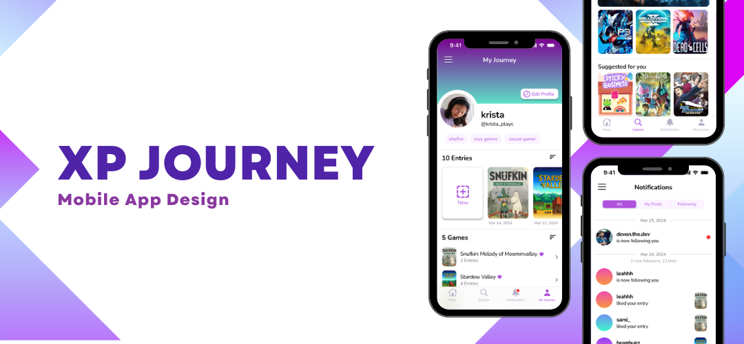
In ACCAD 5141 Interactive Arts Media: UI/UX, we were encouraged to explore a problem space–experiences with video game interfaces–and the challenges users face. However, after talking to users and discovering a gap in their experience–finding time in their busy lives to relax and wanting to connect with others–I got the go-ahead to explore another video-game-related idea focusing less on game interfaces and more on the role video games play in our lives.
XP Journey was conceived as a way for gamers of all skill levels to destress, document play sessions and progress in a virtual journal, make lists and discover new games, and share their thoughts with friends and a virtual community of fellow players.
ROLE AND RESPONSIBILITIES
- My role: UX designer and researcher designing the mobile app from conception to delivery
- Responsibilities: User research (conducting interviews, conducting usability tests), wireframing, prototyping with Figma
THE PROCESS
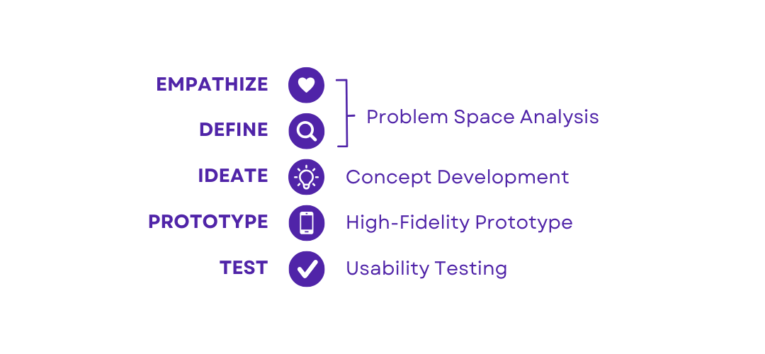
Applying the design thinking framework to the main stages of the process we followed in class, I first seeked to explore the problem space, empathize with users through user research, and to define the problem before delving into design. After understanding the users and their problem, I created concepts for an app to address this problem, delivered a high-fidelity prototype in Figma, and conducted usability testing to validate whether my design was effective.
PROBLEM SPACE ANALYSIS
Before I arriving at the idea of XP Journey, I first had to understand the problem I was trying to address and the users I would be designing for. I started by conducting interviews to learn about why people play video games, whether they play by themselves or with others, previous experiences with games, and what stood out to them from their favorite games. At this point, I was collecting data both about the role of games in people's lives and their perception of video game interfaces.
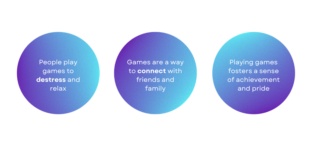
I interviewed 3 participants who each had fairly different backgrounds, but a shared love for playing games. Between all three participants, there were some similarities in why they played games:
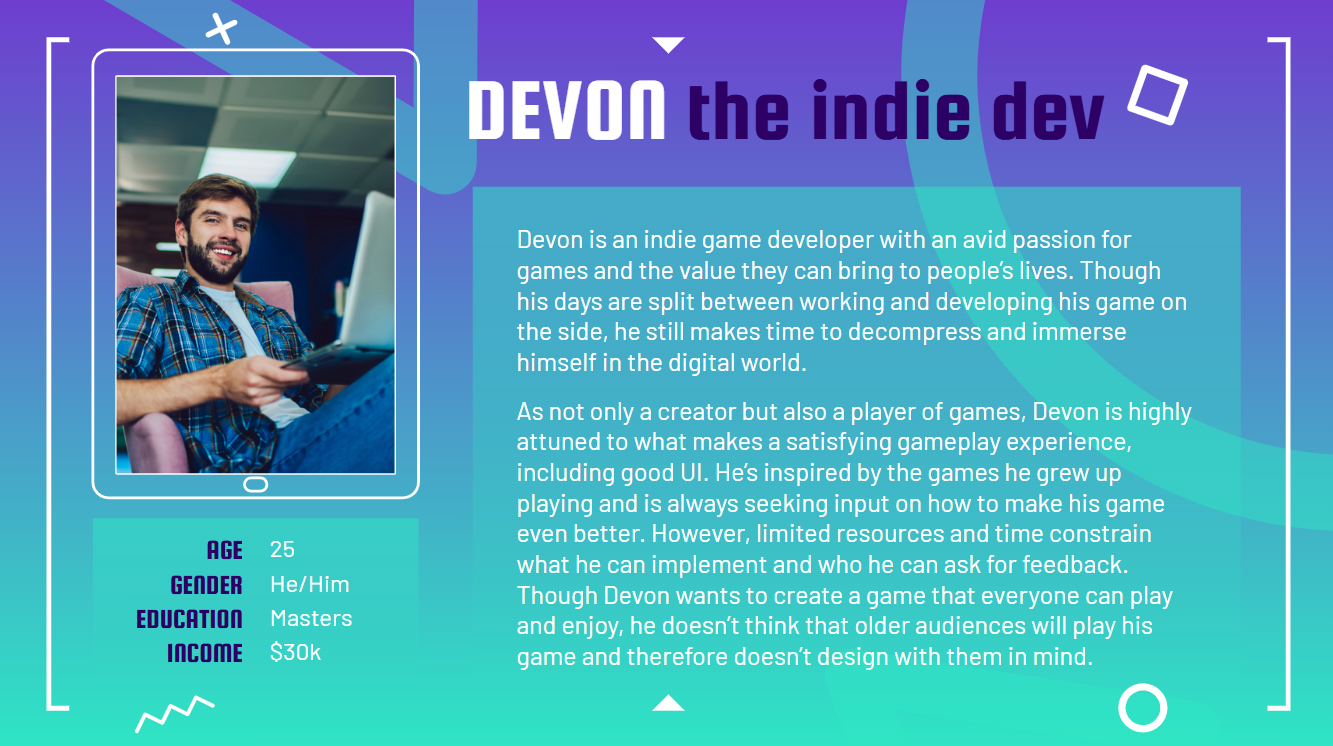
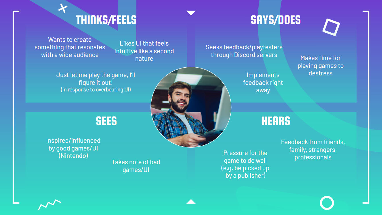
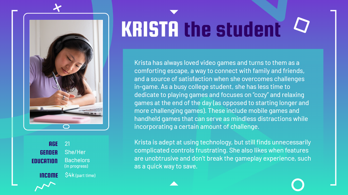
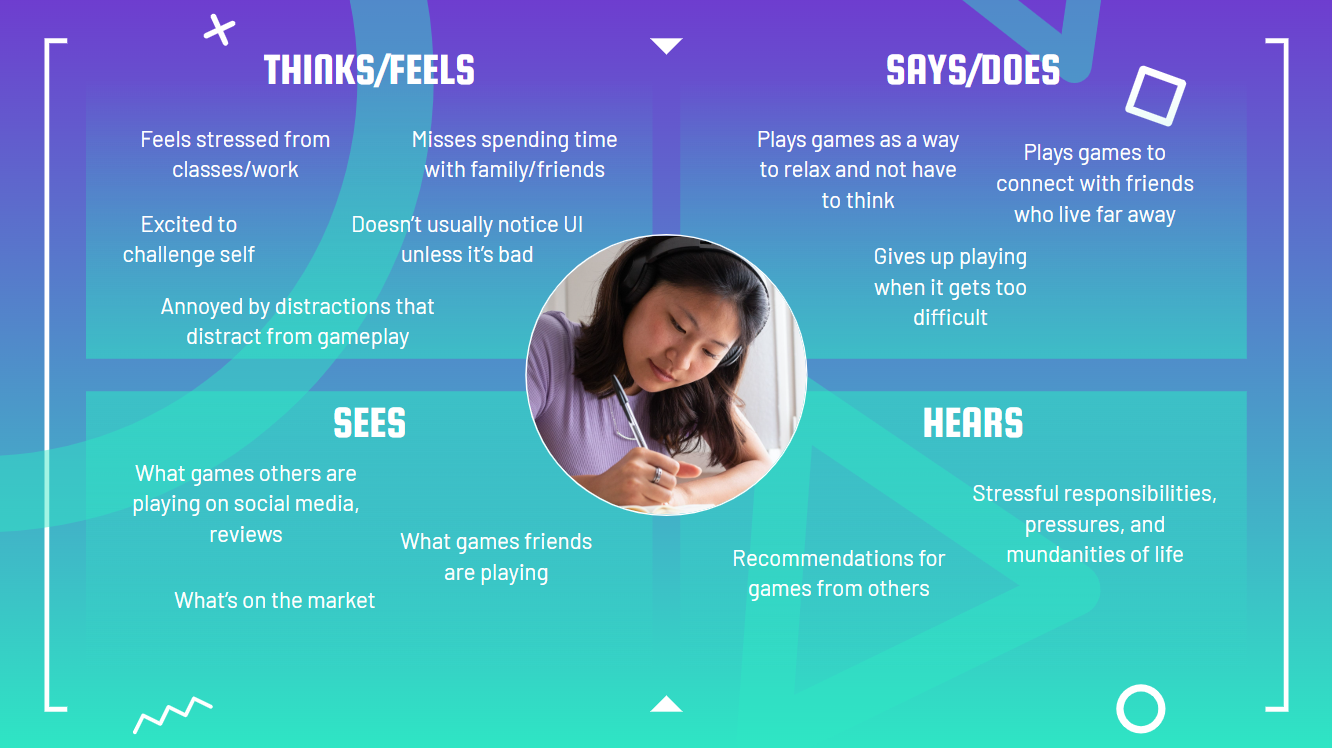
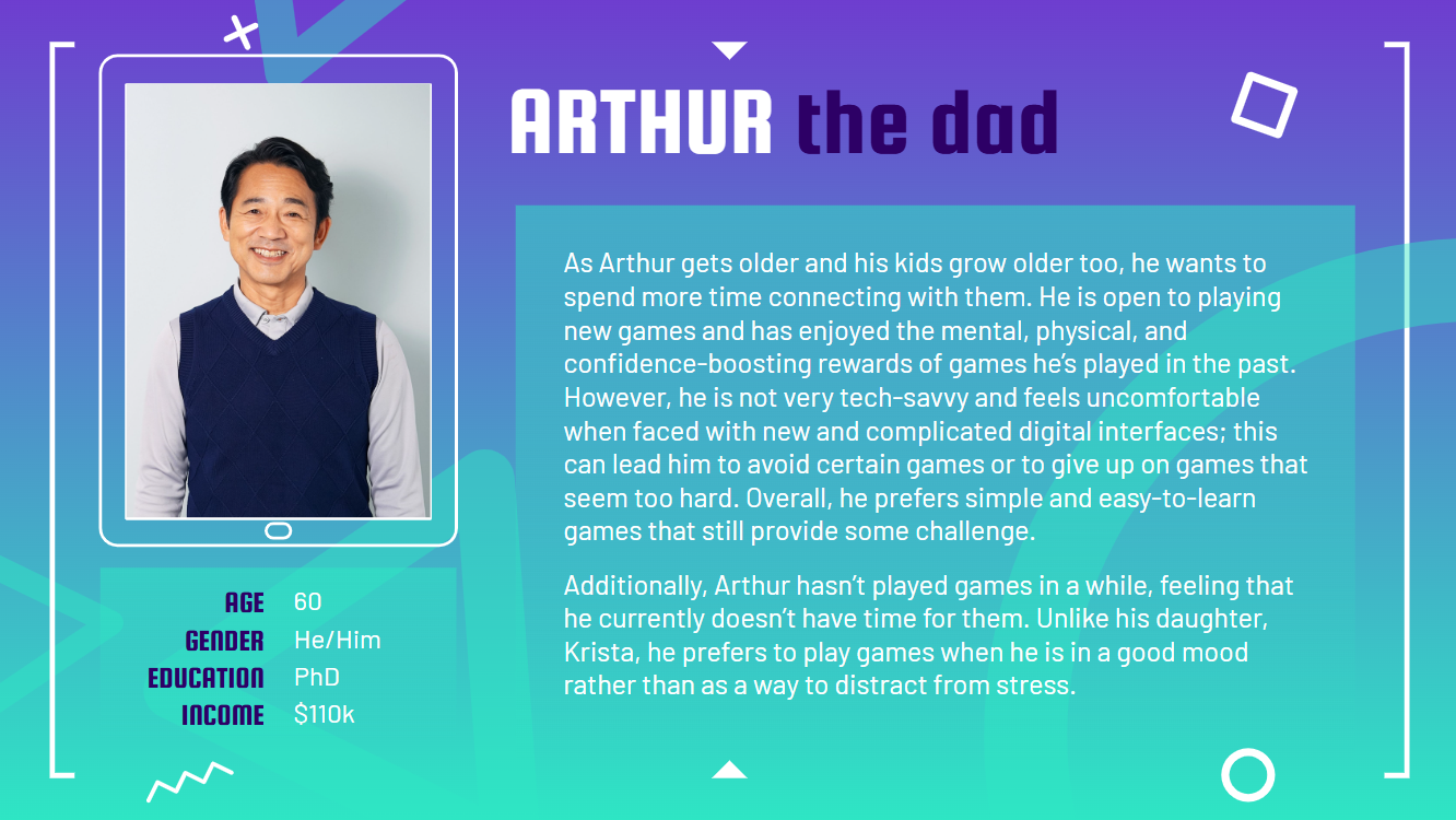
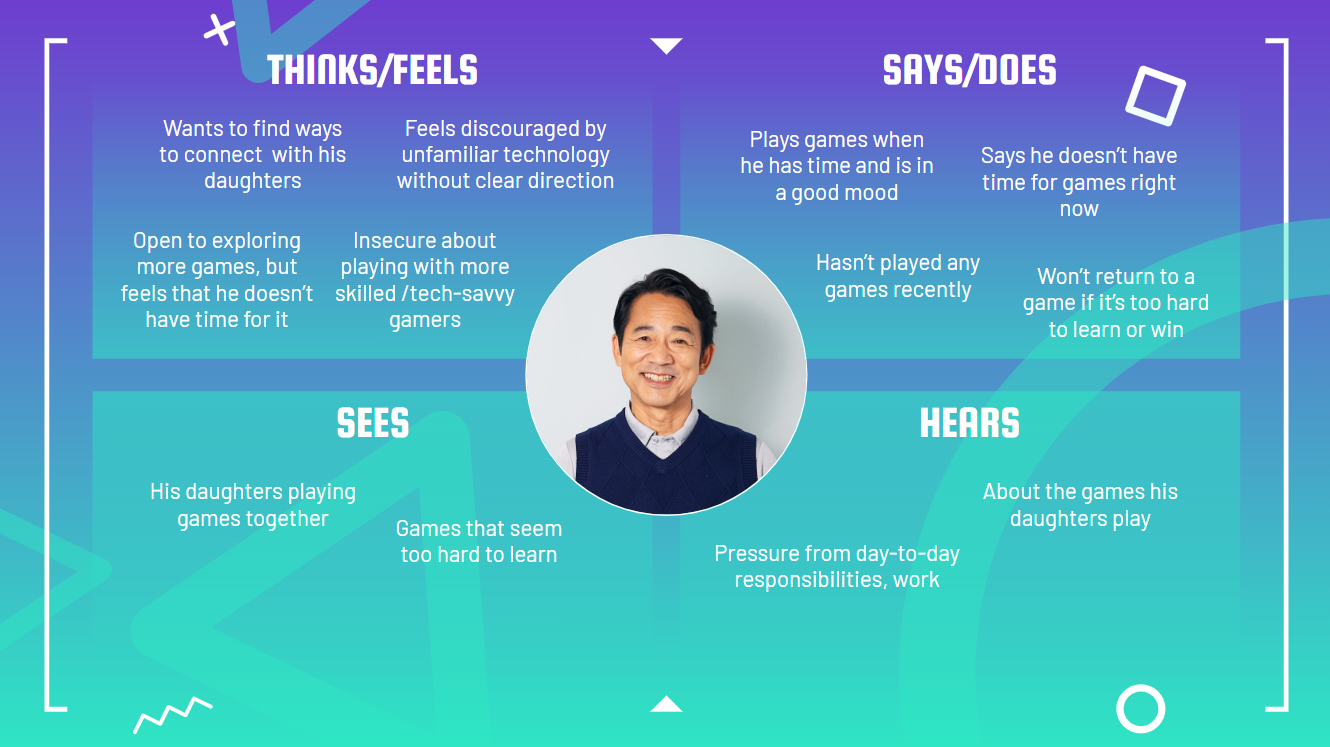
Based on my findings, I created 3 user personas, Devon, Krista, and Arthur, along with empathy maps that summarized each persona's attitudes and behaviors.
Devon the Indie Dev
Krista the Student
Arthur the Dad
CONCEPT DEVELOPMENT
Though each of these personas and their goals influenced the direction of my final design, Krista's story inspired me to think deeper about the problem I wanted to address with my design. Ultimately, I decided to shift away from the issue of game UI and investigate the role video games play in the greater context of our lives.
There were several key pain points that informed my design:
PAIN POINTS
- Users don't have as much time for games in their busy schedules, and may lose track of where they left off.
- Users want to explore new games, but may not currently have the spare time or money to do so.
- Users may prefer to play some games by themselves, but still desire connection and community.
XP JOURNEY
- With XP Journey, users can create journal entries to document their progress and feel accomplished.
- Users can discover new games, view other users' reviews, and save games for later with a wishlist.
- XP Journey acts as a social media platform, as users can post their journal entries, comment, like, and follow others.
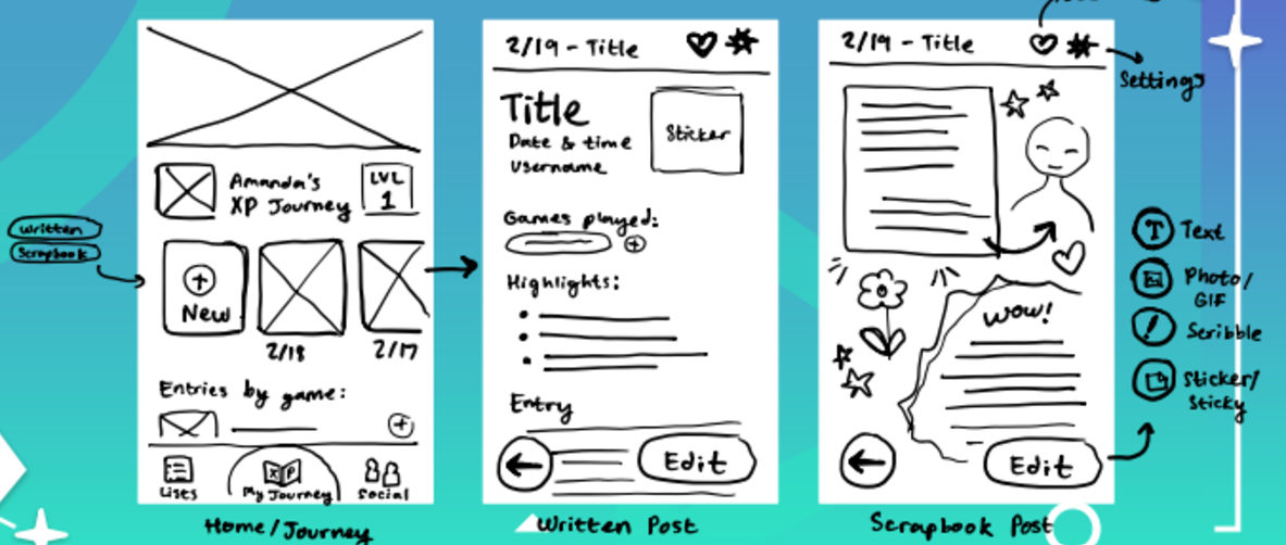
After pinning down the idea for my app, I created several very basic napkin sketches to get an idea for what this could look like. Each user would have their own "journey" with their journal entries, from which they could create new entries in either a written or scrapbook form.
WIREFRAMES & PROTOTYPE
Rather than starting with a low-fidelity prototype as I had done previously, for this project we went from sketches directly to high-fidelity wireframes in Figma. The focus was to show users a more polished prototype during testing for more accurate feedback; additionally, by customizing premade assets, we could expedite the prototyping process even if changes to the hi-fi prototype need to be made.
One main consideration I focused on in this project was designing for the device (I chose to design for iOS) and following interface design guidelines. This meant using components that were familiar and intuitive to iOS users' mental maps; using a package in Figma helped me to do this easily, while still customizing elements to be visually cohesive.
To demonstrate the different functions of XP Journey, I came up with 5 user flows (from the perspective of our persona, Krista):
USER FLOWS
- Follow back your friend Devon (@devon.the.dev)
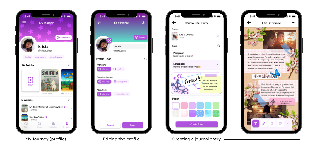
- Customize your profile by changing the banner to a purple star gradient
- Make a new scrapbook-style journal entry about “Life is Strange” and publish it to your profile
- Add “Ni No Kuni: Wrath of the White Witch” to your “Want to Play” list from the Explore page
- Access your feed and view your friend Devon’s post
I then built out each of these flows in Figma.
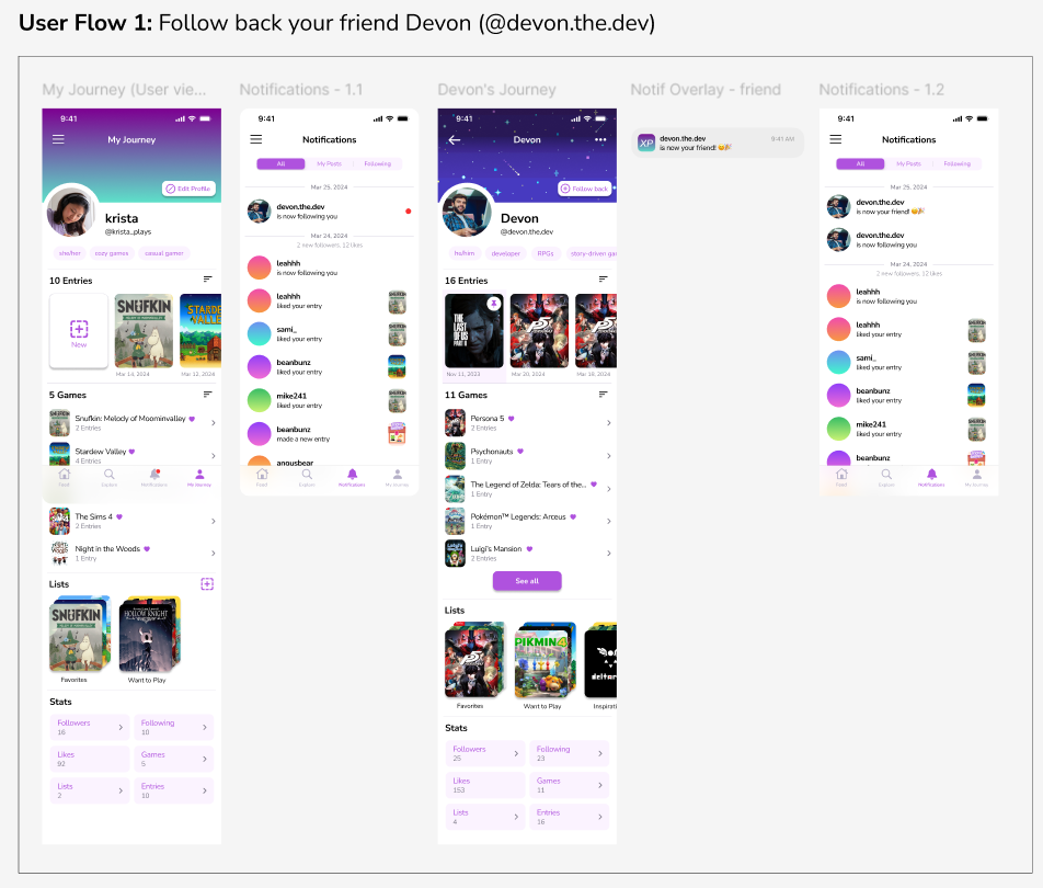
Finally, I linked the wireframes to create a high-fidelity prototype.
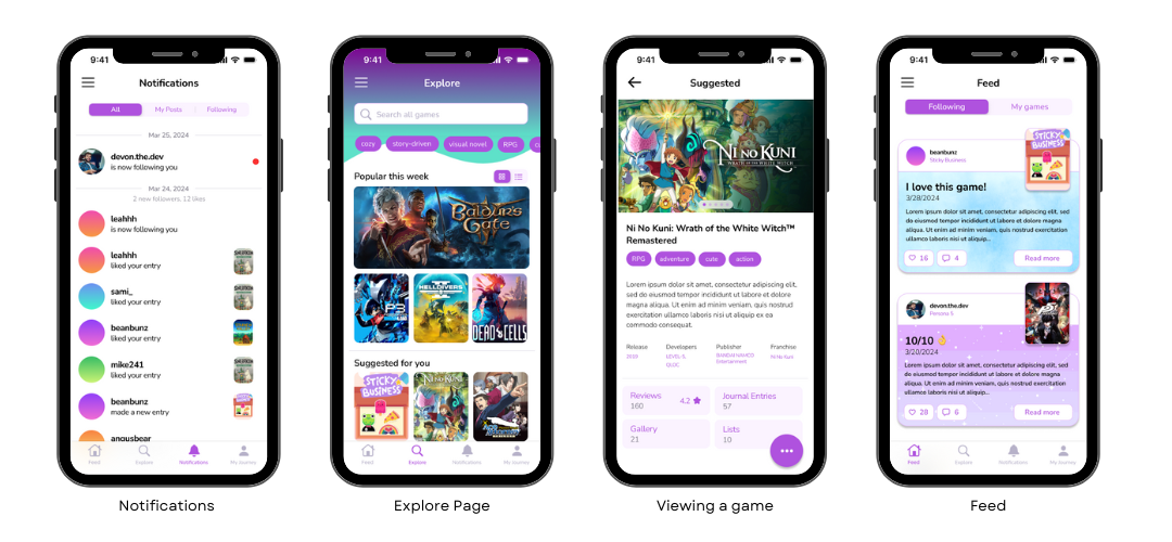
FIGMA PROTOTYPE
You can interact with the high-fidelity prototype below; use fullscreen (button in the top-right corner) for best experience!
USABILITY TESTING
Following the completion of my final prototype, I conducted usability tests to evaluate the effectiveness of my design and any gaps. The participant sample consisted of 5 people within the target demographic for this app (defined as any individual interested in playing and keeping track of games, specifically in the teenager to young adult age range who might connect with the social media aspect of the app.)
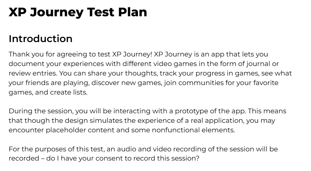
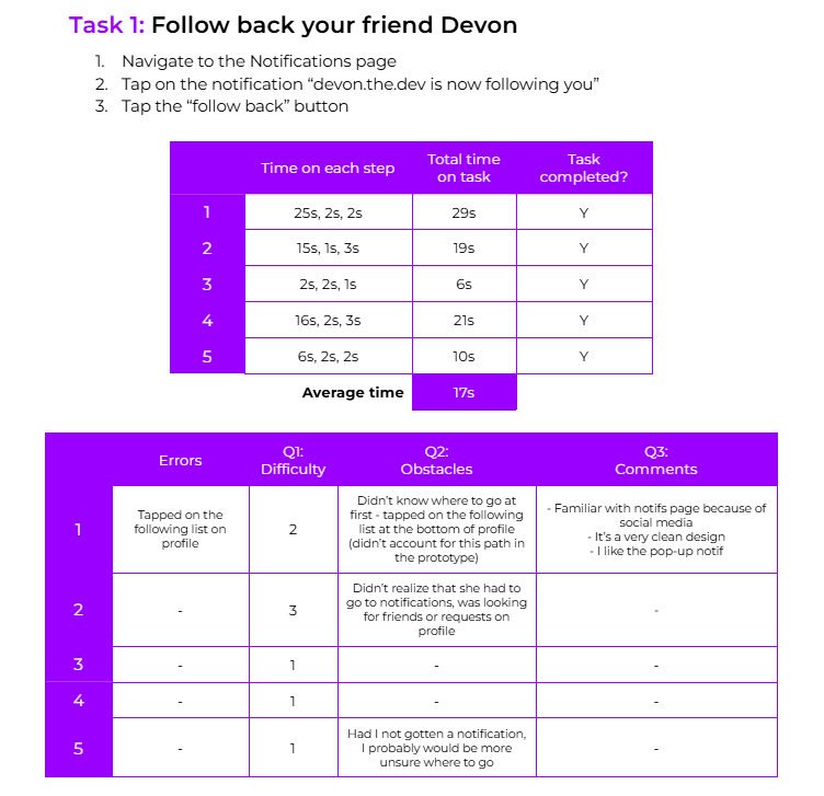
For each participant, I kept track of several metrics such as time on task and task completion as they went through each user flow. Additionally, after completing the user flow, I asked them to describe their experience and rate the difficulty of completing the user flow. Finally, I concluded with several questions about their overall experience, suggestions, and whether they would be likely to use the app.
METRICS
- Time on task (learnability and efficiency)
- Task completion
- Errors
- Obstacles
- User experience
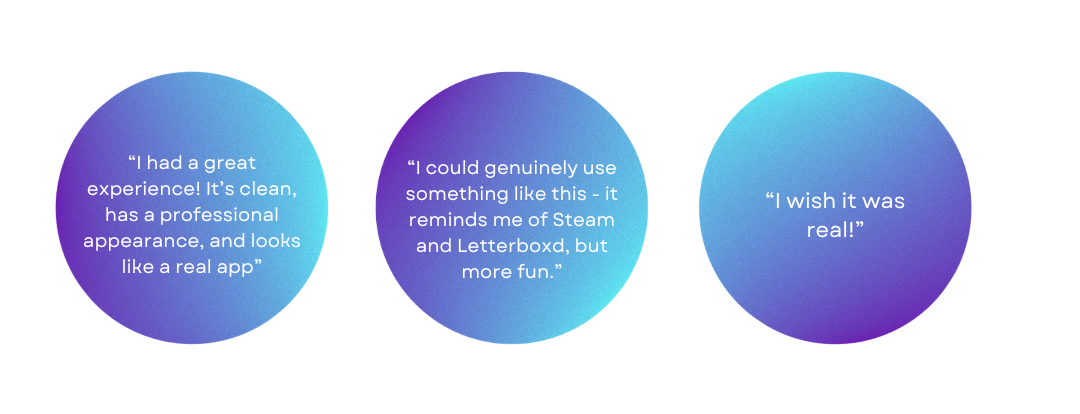
Overall, all of the participants were able to figure out the tasks and had a positive experience using the app. Though participants had varying difficulty with each task, some aspects of tasks were noticeably harder (knowing where to go to follow someone back, knowing how to create a new entry) while others were easier (customizing the profile, adding to a list from the Explore page, and looking a post on the feed).
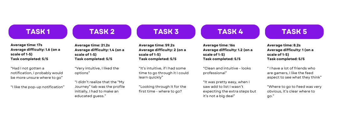
Based on the fact that none of the tasks averaged higher than a 2 in difficulty and that all participants were likely or very likely to use the app (averaging 4.4 out of 5), I believe that XP Journey has great potential to provide value to users.
NEXT STEPS
- Make it easier to see followers and follow requests
- Add suggested users to the Explore page
- Change ‘My Journey’ to ‘Profile’ for clarity
- Make the user ratings more prominent when you look at a game
- Explore a more prominent and intuitive way to create journal entries
REFLECTION
Getting to see this project through from exploring a problem to delivering a polished prototype was incredibly rewarding. My favorite parts of the process were refining the visual design of the app, gathering feedback from users, and witnessing them interacting with (and getting excited about!) XP Journey.