BACKGROUND
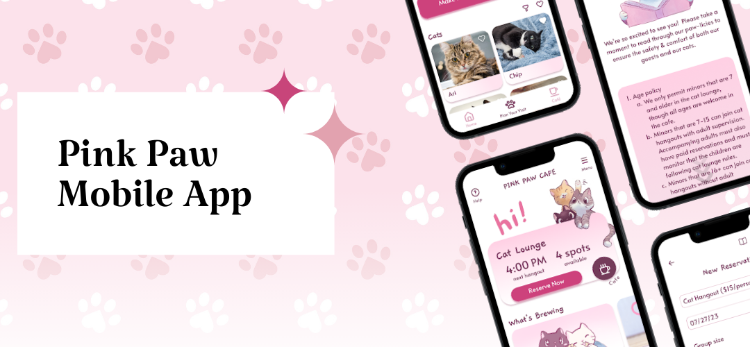
As part of the Google UX Design Certificate, I was challenged to design a mobile app for a cafe. I chose to focus specifically on the reservation user flow for a cat cafe, seeking to address the problem:
Customers need an easy and efficient way to make and edit reservations.
For context, Pink Paw Cafe is a (fictional!) local cat cafe that serves up both coffee and cats in a unique experience. Visitors can grab a cafe item on the cafe side of the building, while the other side lets them reserve time to cuddle with cats. The cafe strives to create a relaxing atmosphere and prides itself on helping many of its feline residents find homes.
With this problem in mind, I set out to accomplish my goal–to design a mobile app for Pink Paw Cafe that allows users to easily and quickly create, view, edit, and cancel reservations.
ROLE AND RESPONSIBILITIES
- My role: UX designer and researcher designing the mobile app from conception to delivery
- Responsibilities: User research (conducting interviews, conducting usability tests), wireframing, low and high-fidelity prototyping with Figma
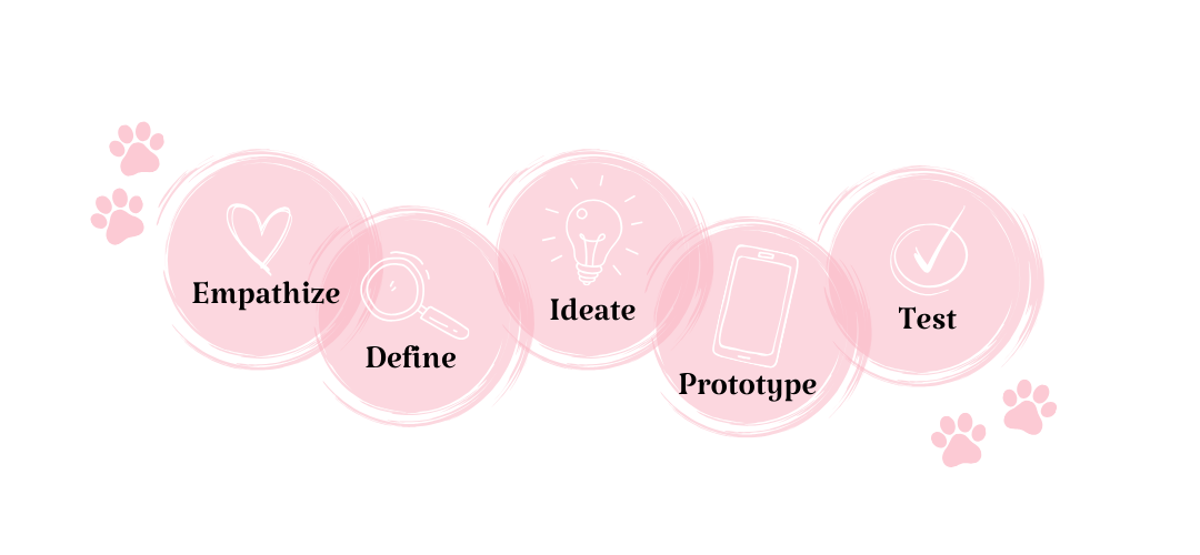
THE PROCESS
USER RESEARCH
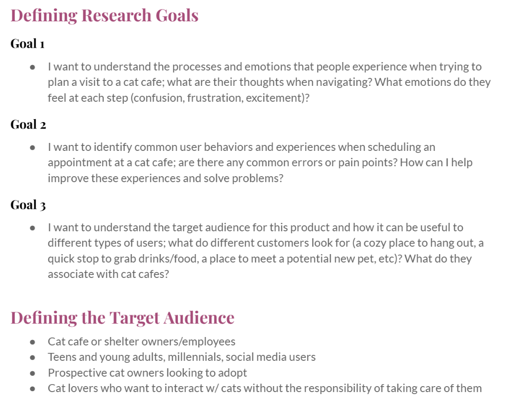
Before designing a solution, I first had to define the problem and understand my users. Who were my users? I started by first identifying my research goals and target audience.
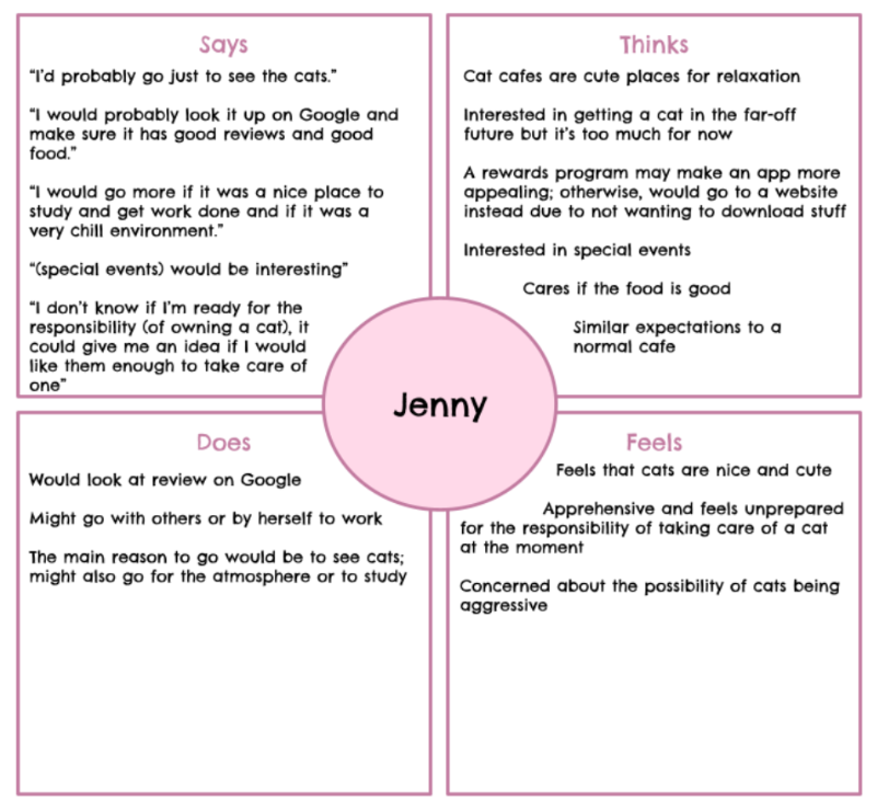
After identifying my target audience, I created an interview guide and reached out to four interviewees to learn more about their experiences and expectations from a cat cafe. What would motivate them to go to a cat cafe? How would they go about planning their visit, and what information would they seek? What challenges might they face? Interviews allowed me to delve into these questions and enrich my understanding of the problem. For each participant, I created an empathy map to summarize their attitudes and behaviors.
Based on these interviews, I discovered several pain points users might face when using an app such as this:

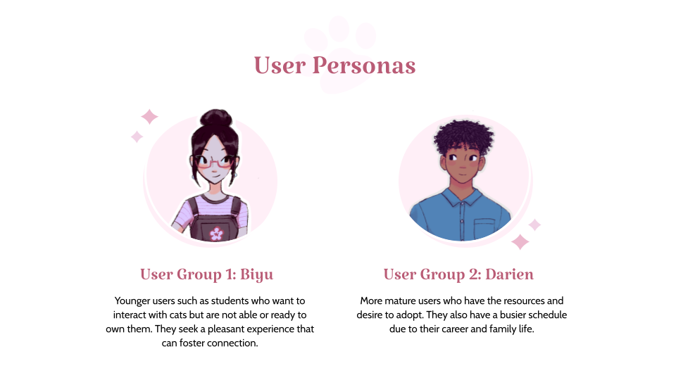
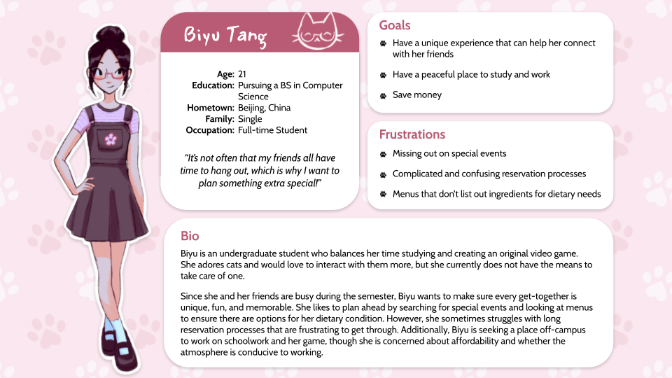
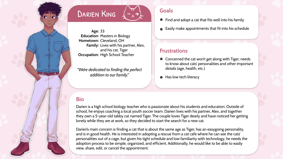
Understanding these pain points was critical to informing the direction of my design. While my design would be focused on the reservation user flow, I still wanted to learn what users would need from other aspects of the site (such as the menu or rewards). Overall, users want to have access to important information such as timeslots and refund policies, while also having the flexibility to edit or change their appointment. From there, I created two user personas–Biyu and Darien–who represented two different user groups with different goals.
Problem Statement
Biyu is an outgoing college student who needs a way to see special events and promotions, a simple reservation process, and a menu that includes details about ingredients because she wants to have a memorable experience with friends and has dietary needs she must plan for.
Problem Statement
Darien is a busy high school teacher and prospective cat owner who needs a way to make reservations for him and his partner that is efficient, simple, and offers assistance because he has a tight schedule and is not very tech savvy.
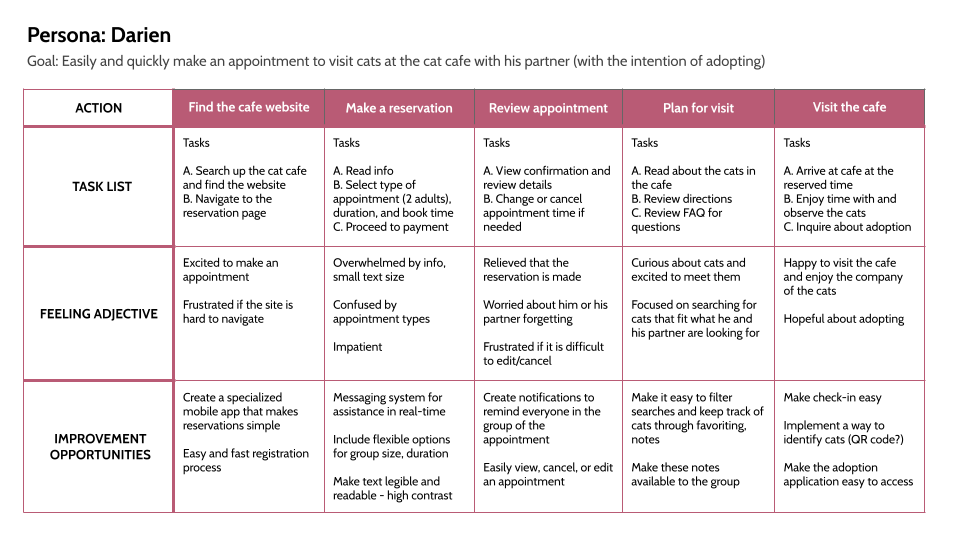
With these personas and their goals in mind, I explored the current paths they might take to make a reservation and created a user journey map. This exercise helped me empathize with the user at each step of the process and revealed ways my design could fill in any gaps in their experience.
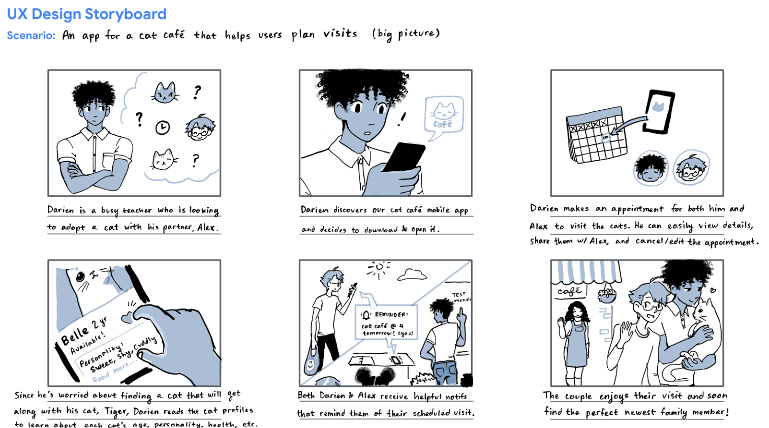
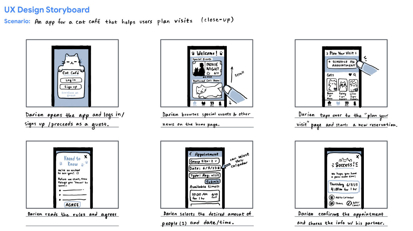
Additionally, creating both big-picture and close-up storyboards allowed me to visualize the user flow Darien might go through, convey the potential of my app with a narrative, and to explore all the interactions that contribute to their user experience.
STARTING THE DESIGN
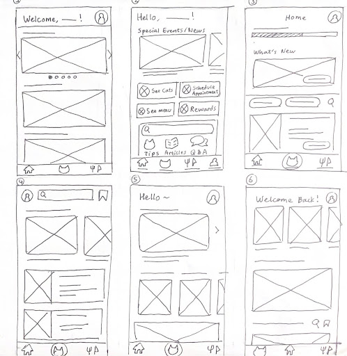
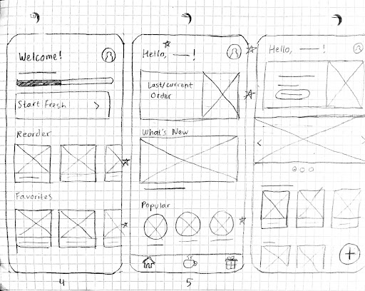
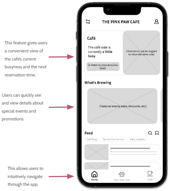
Before creating digital wireframes, I sketched out some ideas on paper to explore different ways to address user needs. For example, I created a variety of options for the home screen, but I decided to highlight features that gave users easy access to the app’s important functions (making a reservation and seeing the menu) as well as special events and promotions.
As I converted my paper designs into digital wireframes, I continued to consider user feedback from my earlier research.
Below is the low-fidelity prototype linking these wireframes to create the user flow of making a reservation.
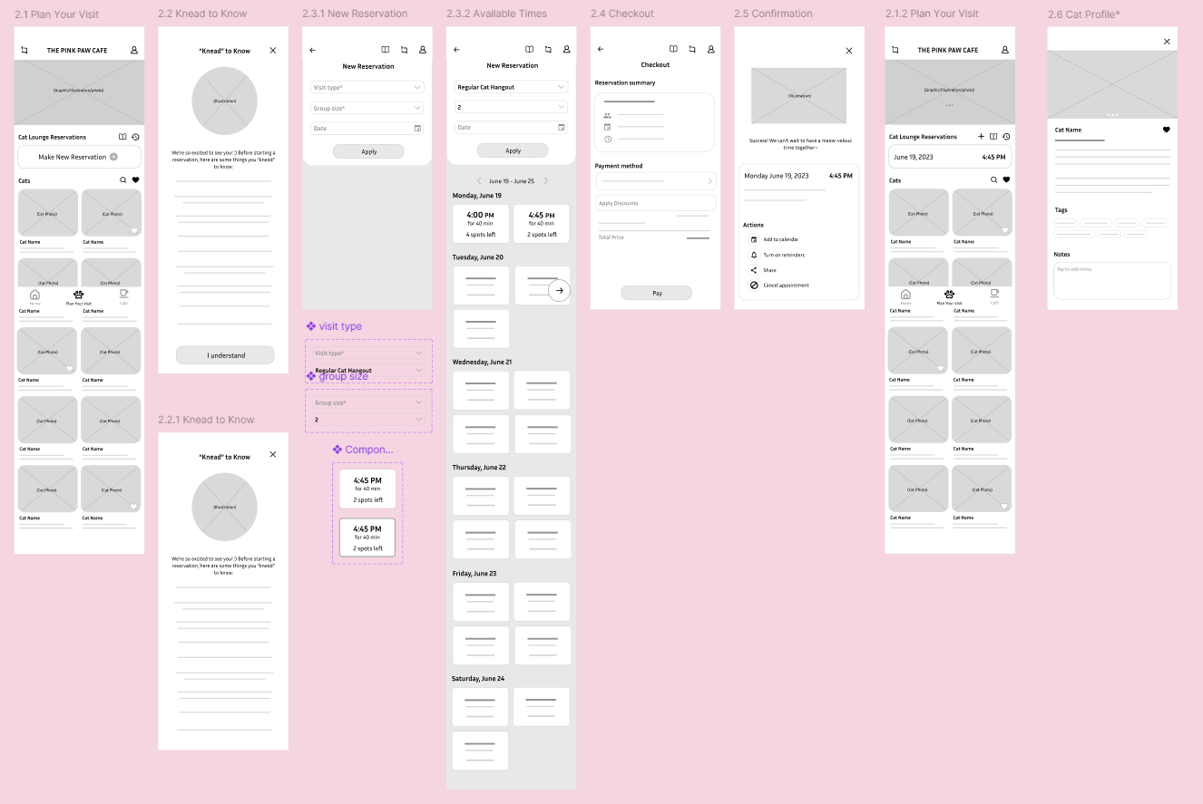
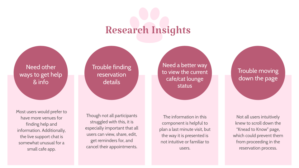
After completing this initial prototype, I conducted a usability study with 5 participants to gain insights on what could be improved before moving on to mock-ups. I wanted to know how long it would take for participants to complete a reservation, if the user flow was intuitive to understand, and if there were any common user errors or challenges. This step was crucial, as it highlighted some major flaws in the design to address.
REFINING THE DESIGN
Based on the usability study, I made some changes going into high-fidelity mockups. One main feature I decided to change based on feedback was an interactive component showing the current busyness in either the cafe or the cat lounge. Though users thought the information presented there was helpful, the format was confusing for all 5 participants. After discovering this insight, I was able to create a more intuitive and familiar way to view this information that has clear action cues and also gives users a shortcut to the app’s main functions.
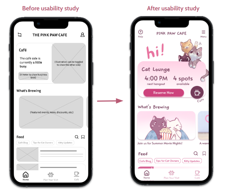
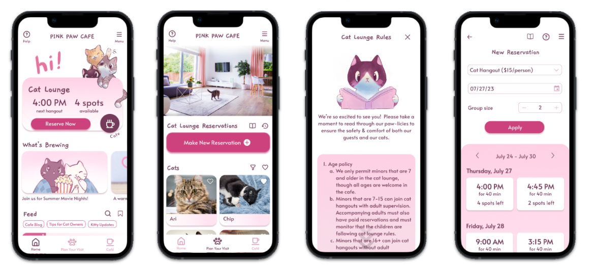
Finally, I linked the mockups to create an interactive high-fidelity prototype.
FIGMA PROTOTYPE
You can interact with the high-fidelity prototype below; use fullscreen (button in the top-right corner) for best experience!
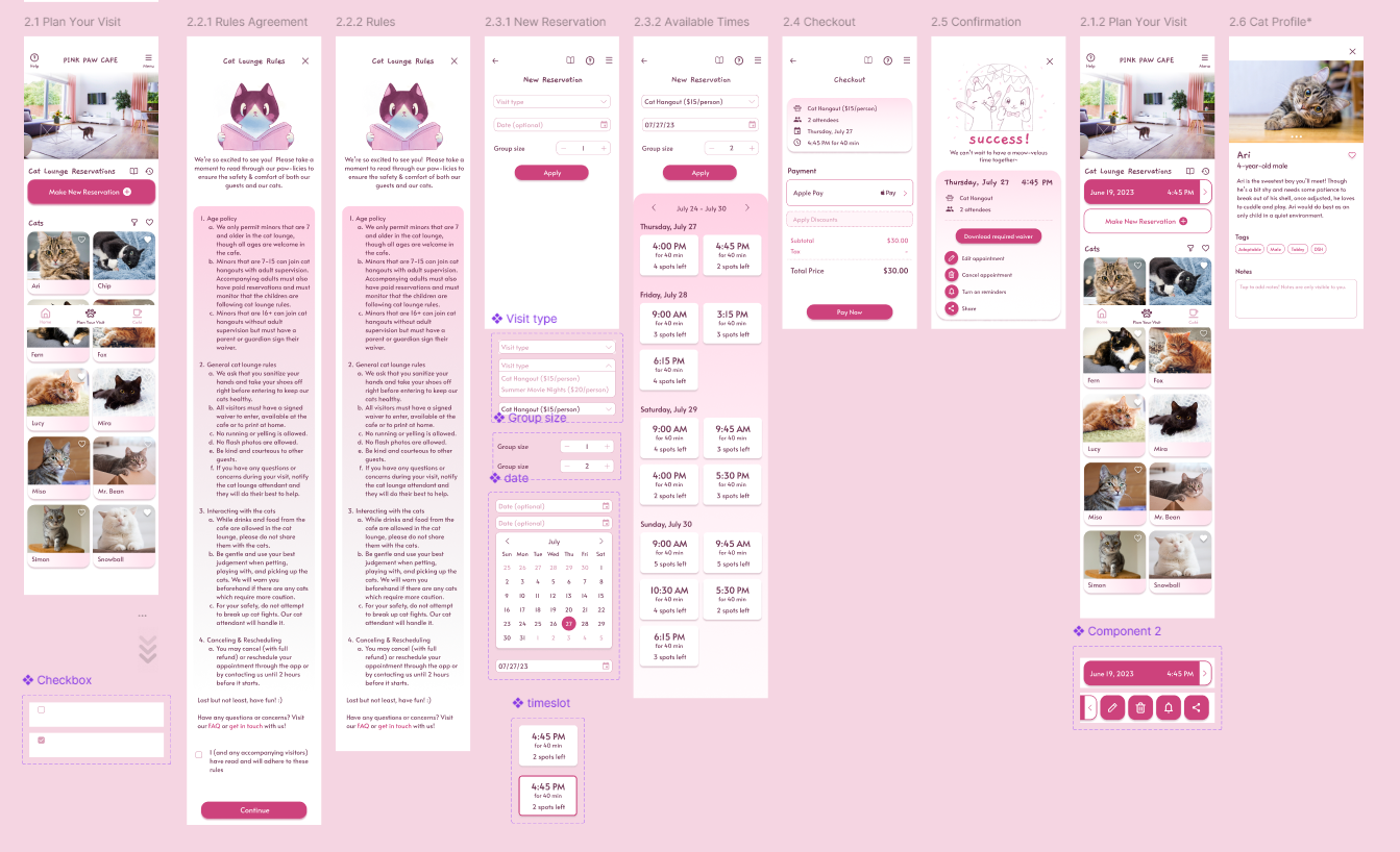
The Pink Paw mobile app not only meets the users’ needs, but also gets them excited about visiting the cafe.
NEXT STEPS
- Conduct another round of usability tests to evaluate whether user needs have been met and pain points have been addressed.
- Further consider ways to improve accessibility, such as language options, different text sizes, high contrast mode, etc.
- Build out and test the menu and rewards user flows with new prototypes.
REFLECTION
During the summer of 2023, my first real foray into UX research and design was with the Google UX Design Certificate–an exciting opportunity for a beginner like me to learn the ropes, build a foundation in design thinking and skills, and gain hands-on experience with creating deliverables. Though I didn’t continue with the certificate as my attention would soon turn to coursework during the semester, it was a rewarding experience to finish my first UX project from conception to final prototype. The curiosity and desire I felt to create something useful and visually pleasing was what drove me during each iteration of the design, and what cemented my passion for the field of UX.